Inside Our Branding: The Design Choices Behind Bloom Mama Wellness
This post outlines the visual identity of Bloom Mama Wellness, including our theme, color palette, typography choices, and the meaning behind our business name. It also shows three Instagram tiles to demonstrate our brand consistency.
11/7/20251 min read

Theme & Branding Style
Bloom Mama Wellness is designed to feel warm, calming, and empowering for prenatal and postnatal women. Our branding blends softness and strength to represent the dual nature of motherhood. Every visual element—colors, typography, and imagery—was chosen to inspire confidence, comfort, and positive energy.
Colour Palette
Our color palette expresses growth, emotional balance, and wellness:
#6BE171 (Fresh Green): health, renewal, and harmony
#692636 (Deep Burgundy): emotional strength, warmth, and safety
#EA9570 (Peach Orange): positivity, motivation, and friendliness
#694750 (Warm Brown): trust, grounding, and stability
#FD5BBD (Bright Pink): feminine power, joy, and vitality
#292929 (Charcoal Black): clarity, contrast, and professional readability
#D9D9D9 (Soft Gray): balance, calmness, and cleanliness
Together, these colors create an identity that feels supportive, uplifting, and strong—perfect for maternal wellness.
Typography
Typography is an essential part of our brand identity.
Moontime adds a soft, elegant, nurturing touch, representing emotional connection and compassion.
Distillery Strong communicates strength, stability, and professionalism.
Together, they create the perfect balance of compassion and confidence, reflecting the Bloom Mama Wellness mission of guiding mothers with both warmth and structure.
Why We Chose Our Business Name & Category
The name Bloom Mama Wellness was chosen to symbolize growth and transformation. “Bloom” represents flourishing physically and emotionally; “Mama” connects directly with our audience; and “Wellness” reflects our holistic approach to fitness, recovery, and emotional wellbeing. We selected the prenatal and postnatal fitness and wellness category because many women need safe, specialized support during and after pregnancy. Our branding supports this mission through empowering colors, balanced typography, and messaging focused on trust and confidence.
Mood & Feeling
The overall mood of the brand is warm, supportive, balanced, and empowering. Every element is designed to help mothers feel confident, encouraged, and cared for throughout their wellness journey.
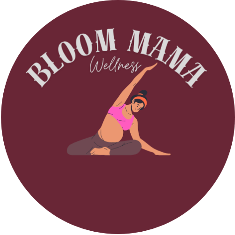
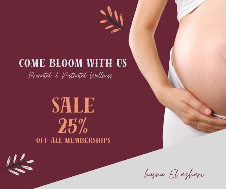
Instagram Tiles : Brand Consistency Examples
These three tiles demonstrate how our brand appears consistently across social media. They use the same color palette, typography, and visual tone, strengthening brand recognition and building trust with our audience.


Contact
We're always here to help you.
bloommamawellnessfit2227@gmail.com
+613-790-9396
© 2025. All rights reserved.